Welcome to the jubilee journal
Here, we share expert planning tips, design inspiration, real event stories, and behind-the-scenes glimpses into the magic we create. Whether you’re dreaming up your wedding, hosting a milestone event, or simply looking for creative ideas to make life’s moments more special, our journal is filled with insights to guide and inspire. At Jubilee Events, we believe every celebration should be as meaningful as it is beautiful—so let’s bring your vision to life, one unforgettable detail at a time!


Guidance
Filter
Weddings
Celebrations
Vendor spotlight
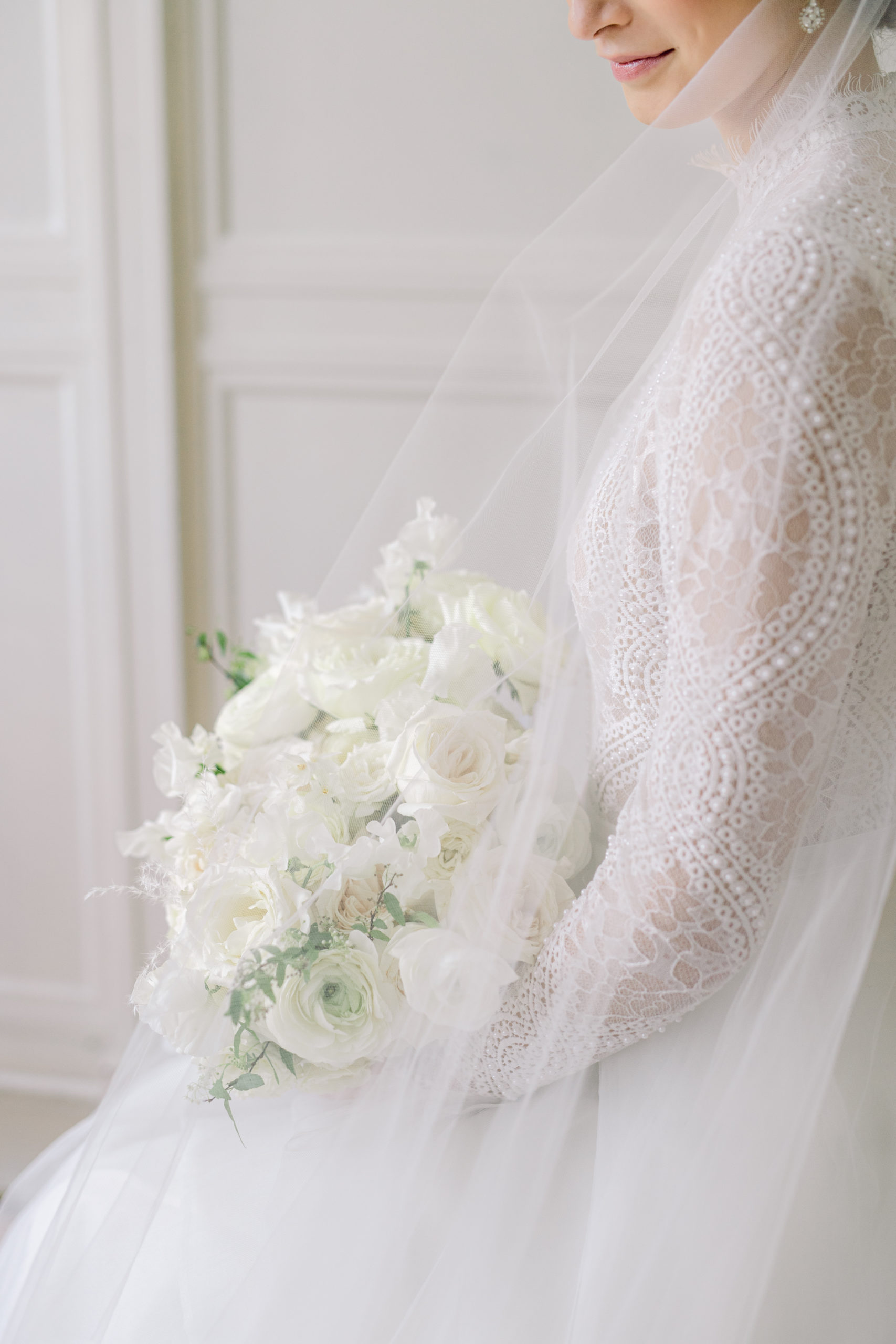
It’s not every day this girl gets to play around with her industry friends to create magic… Wait, yes it is! In this case, the purpose behind our get-together was just a little bit different, but still magical nonetheless! Together with some of Connecticut’s finest and best wedding creatives, we built a photoshoot around one of our favorite aesthetics ever: the classic wedding! If you look under our Weddings gallery, you’ll see a long list of weddings we’ve been trusted to design. Each one is as unique as the couple we’re celebrating, as our design expertise knows no bounds.
What are the most prominent elements of our designs? They’re timeless, iconic, classic, personal, custom, and fun, of course! For this shoot, we set out to create something we’ve only been dreaming of, and we hope this gives you an idea of how perfect your celebration can look!
A Classic Wedding: Inspiration Board
We started our palette off fresh with all white, touches of ivory only for dimension. We sprinkled some gold for added romance and built in an abundance of lush texture. The vibe for this was, you know it, classic, iconic, timeless, clean, romantic, elegant, and fresh!

A Classic Wedding: Bringing the Dream to a Reality
From there, we teamed up with the most meant-to-be crew to bring to life what was subtly living in our minds! Brooke Allison, our cheerleader, and leader-in-excitement captures the pure essence of anything on the other side of her lens. That day was no different, encapsulating this dreamy monochromatic goodness!
The final result? Well, take a peek and get wrapped up in all the perfection!


credit reel
Photography: Brooke Allison Photography
Venue: Gentle Bull
Event Planning + Design: Diana of Jubilee Events
Flowers: Flowers by Justine
Styling: Beth Chapman Styling
Stationery: Coral Pheasant Stationery
Beauty: Amber Papastavros
Fashion: WToo Watters by The White Dress by the Shore
Rentals: PEAK Event Services, borrowedBLU, Nuage Designs
Cake: Sugar Therapy
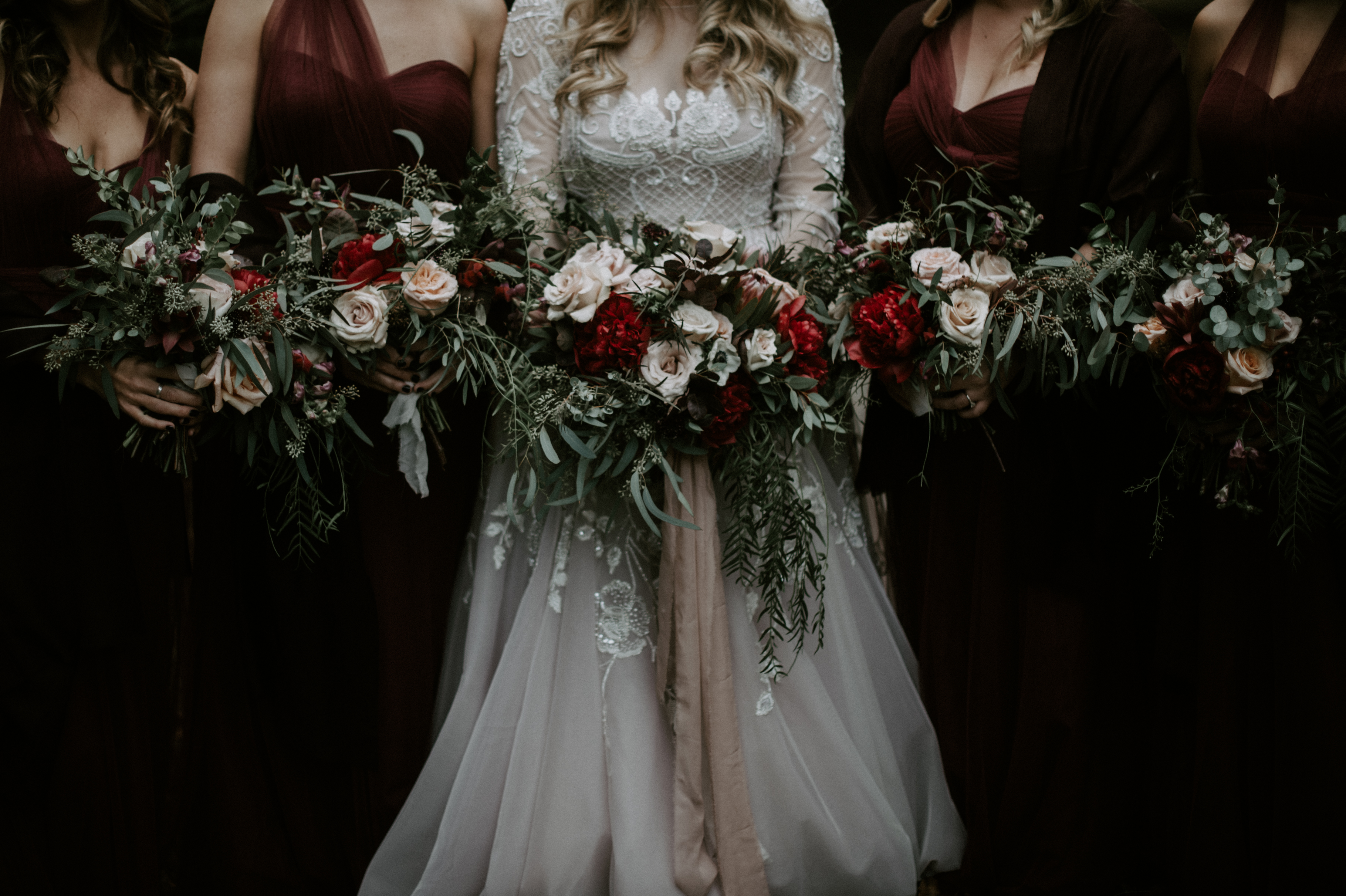
There is something to love about each season in New England. Even if you hate the cold, you have to admit the magic found in the way the snow falls. It’s so peacefully quiet. And clean!! I don’t enjoy the Summer humidity one bit but being able to enjoy the warm sunlight hitting your skin or dipping your toes in the ocean can’t really be beaten. In the end, though, I am a Fall girl. I cannot get enough of the vibrantly colored leaves or the smell of wood stoves turning on to heat up the house. Needless to say, finding inspiration for Fall is a hobby! Designing Fall wedding color palettes sends our hearts soaring!
Lucky for us, Connecticut boasts a number of gorgeous venues to host your celebration, and, boy, do we adore a good Fall wedding! As we’ve been busy preparing for the rest of our 2020 (and 2021!) weddings, I want to give you all some ideas for building the perfect Fall color palette for your Connecticut wedding!
The Fall is the time for deep, romantic, saturated shades that you’ll find in that favorite sweater or Fall dish you’d prepare. If you would like to prepare the ultimate Fall fete, check out some of our fav autumn dishes here!
Fall Wedding Color Palettes: Earthy and Organic

beige // mustard // sage // evergreen // lipstick // deep plum // bronze


photographer: carla ten eyck // floral: sweet talk floral // beauty: catie bane // fashion: made with love, valentino tailors from the white dress by the shore
Fall Wedding Color Palettes: Wine Tones

taupe // ivory // blush // vintage pink // wine // chestnut
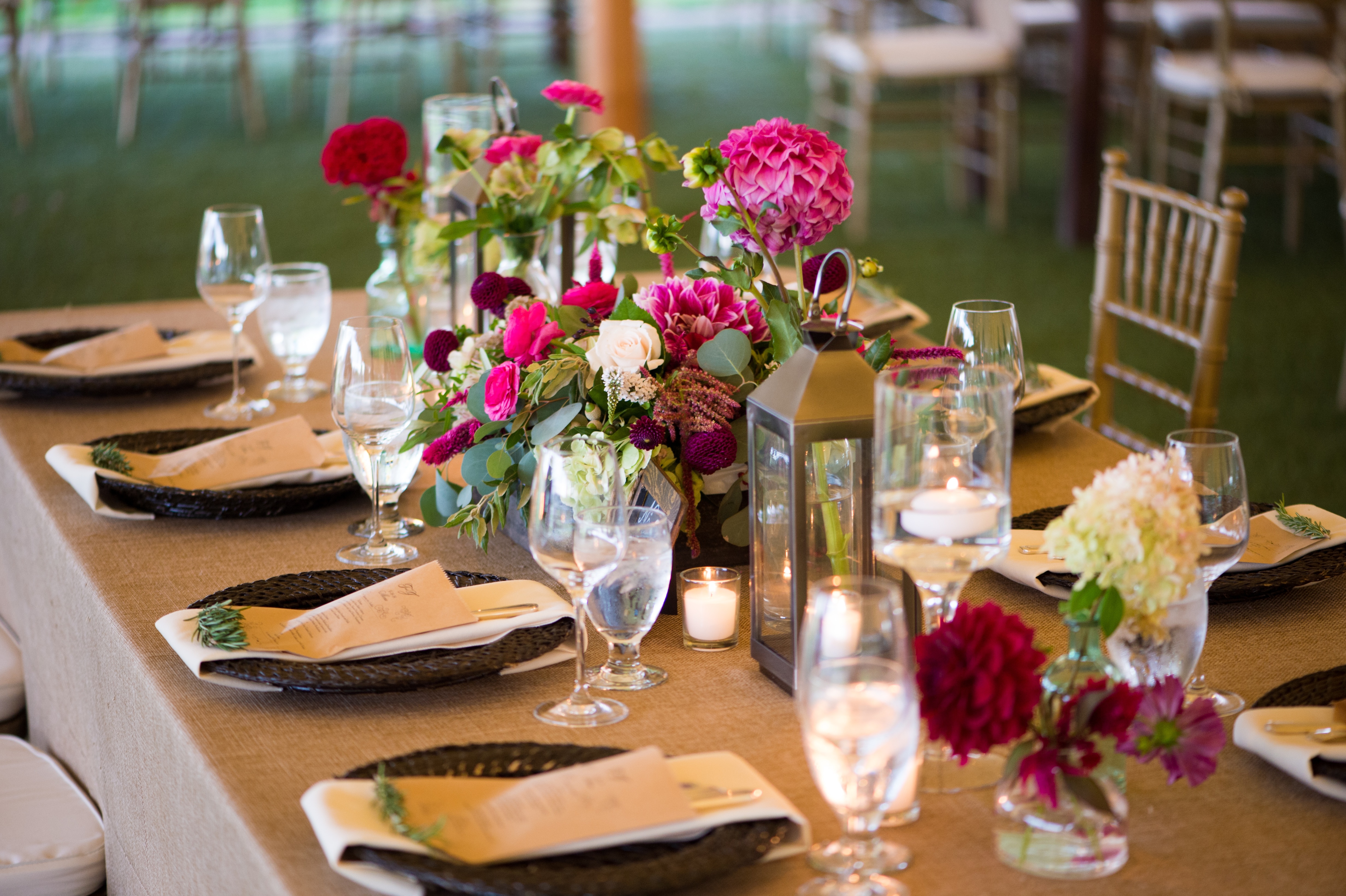
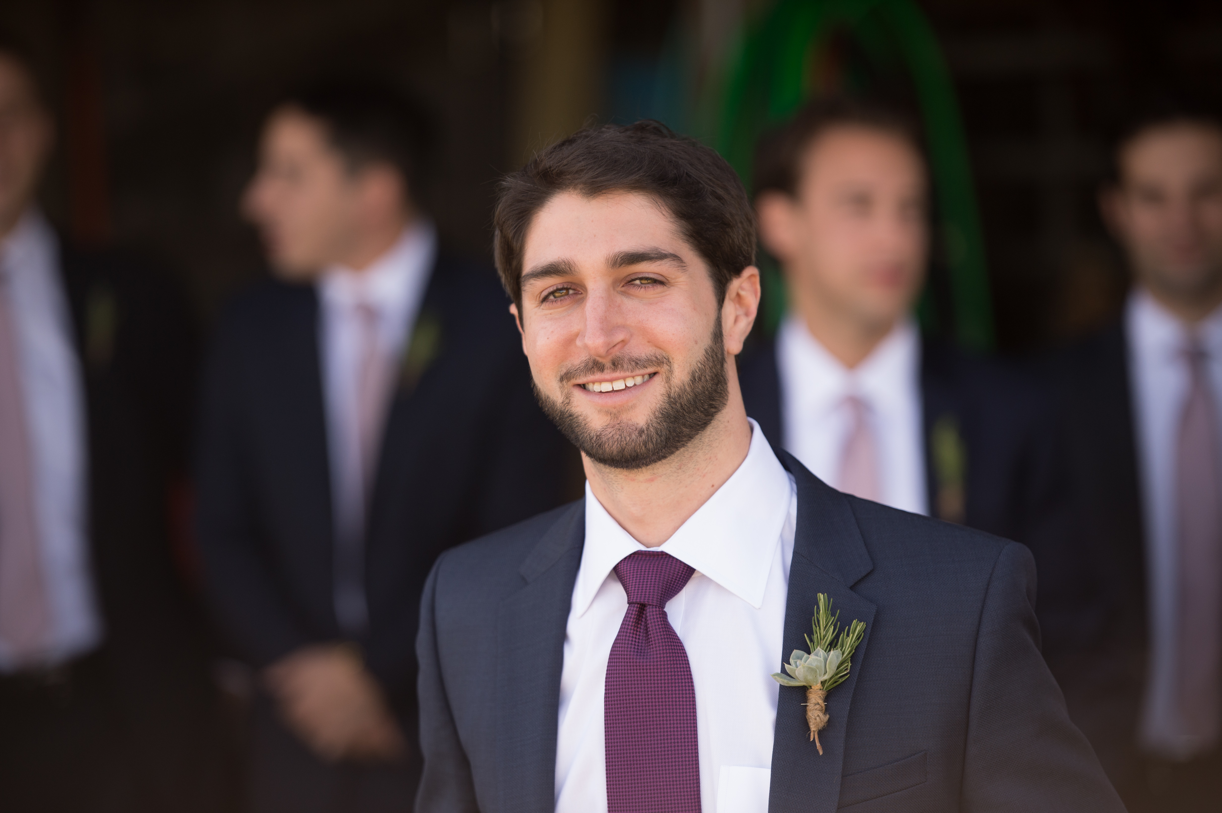
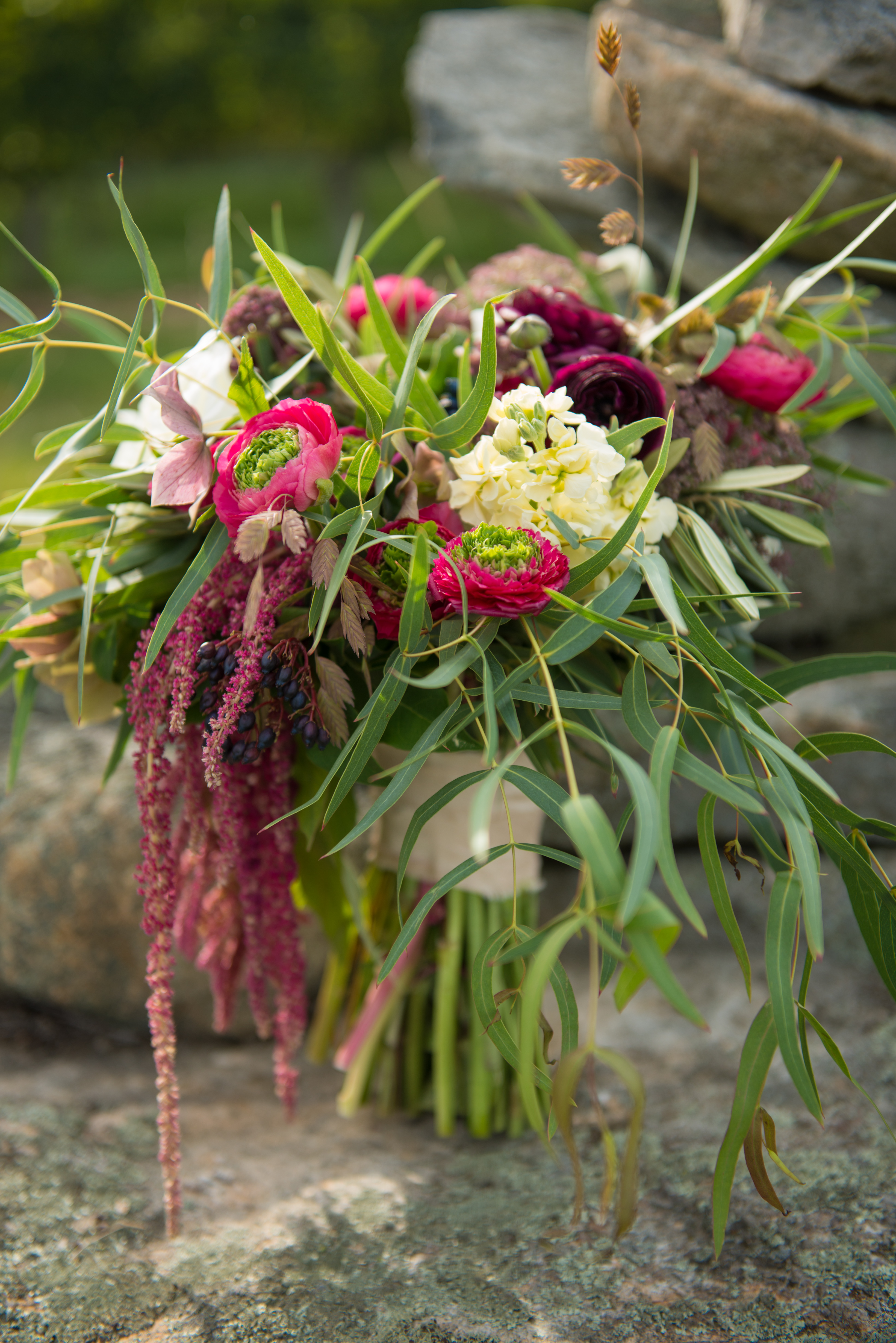 photographer: robert norman photography // floral: blush floral design // rentals: peak event services
Fall Wedding Color Palettes: Moody and Dramatic

vintage ivory // gold // blush // wine // marsala // forest green
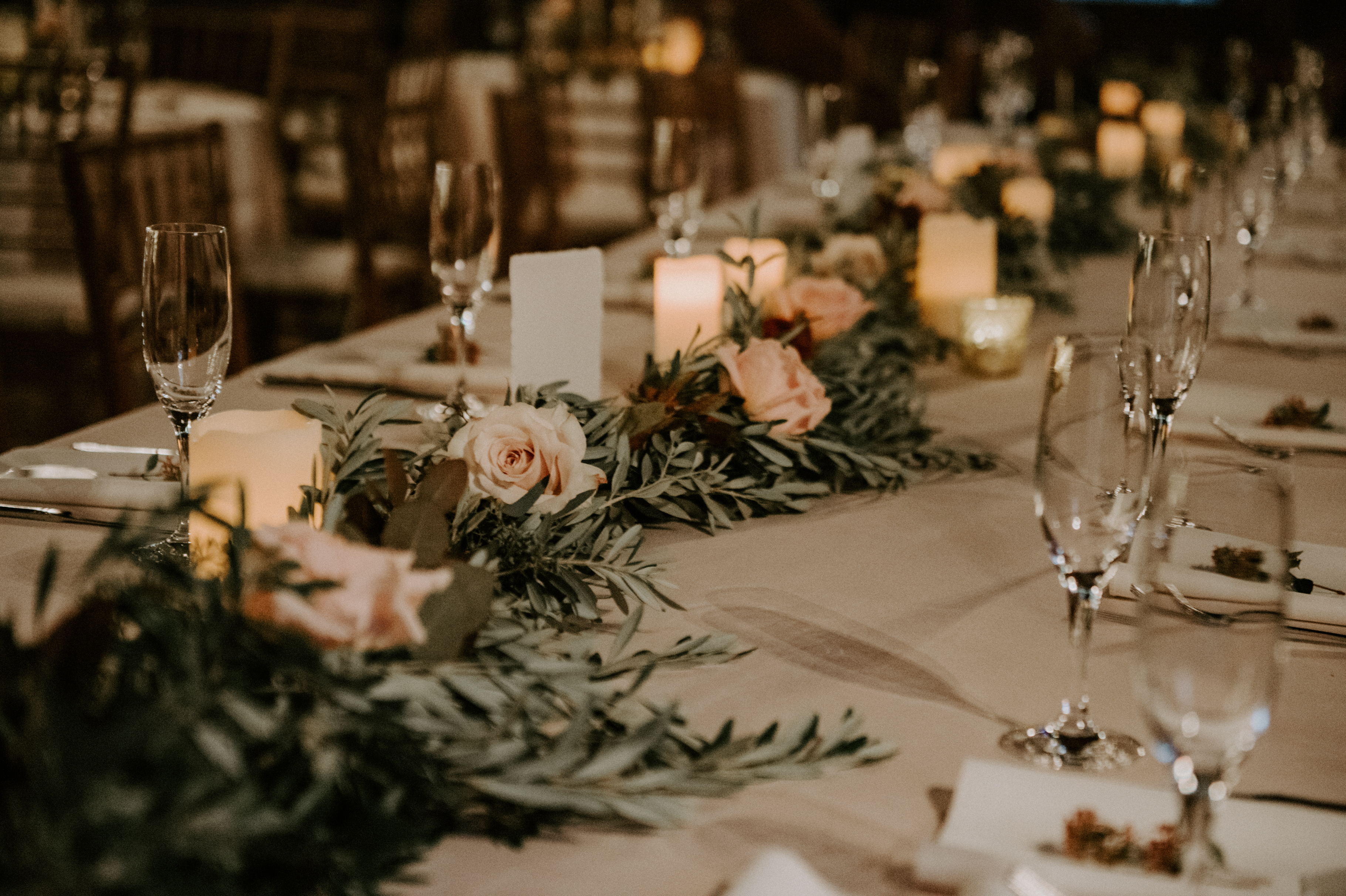
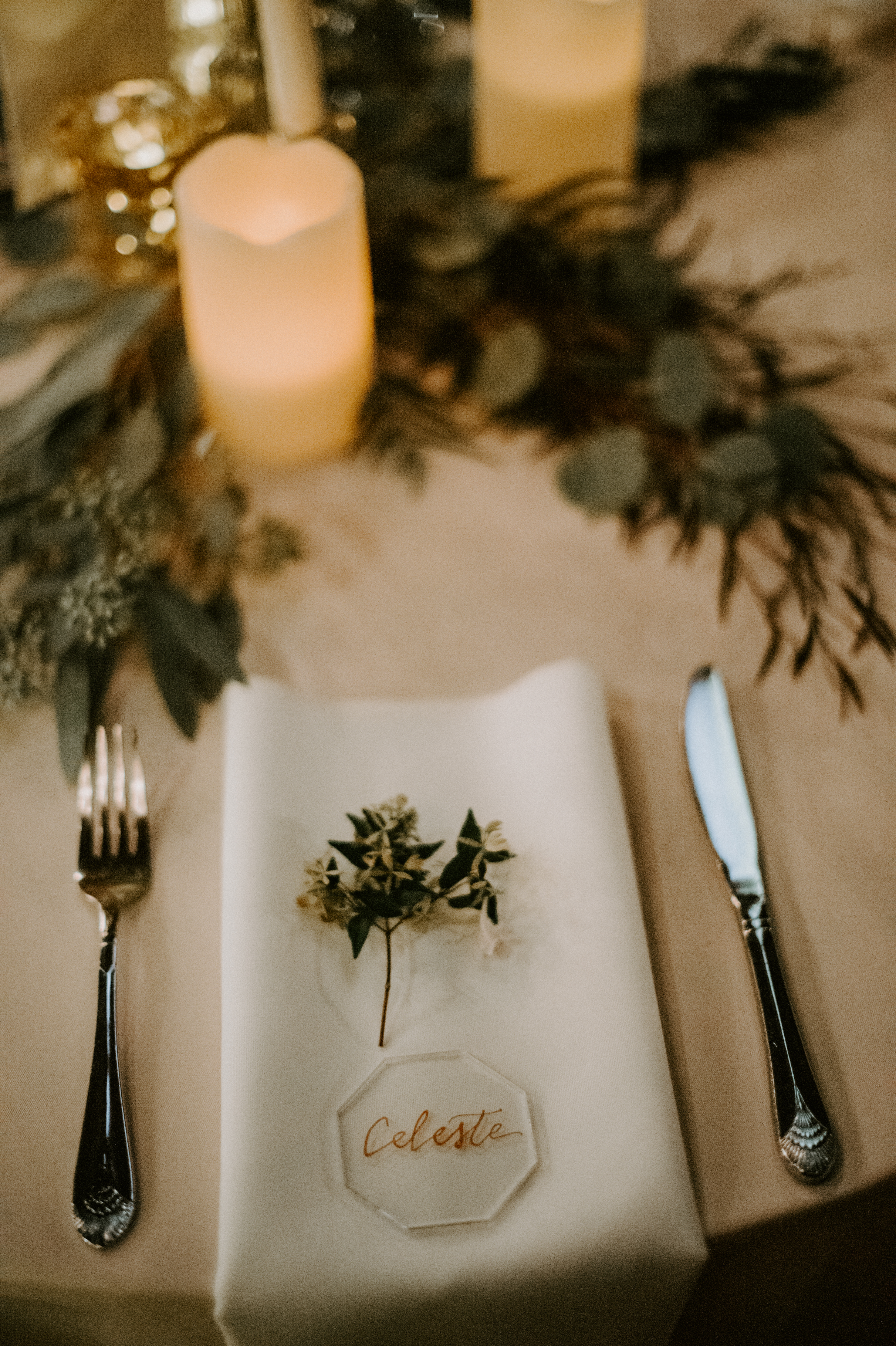
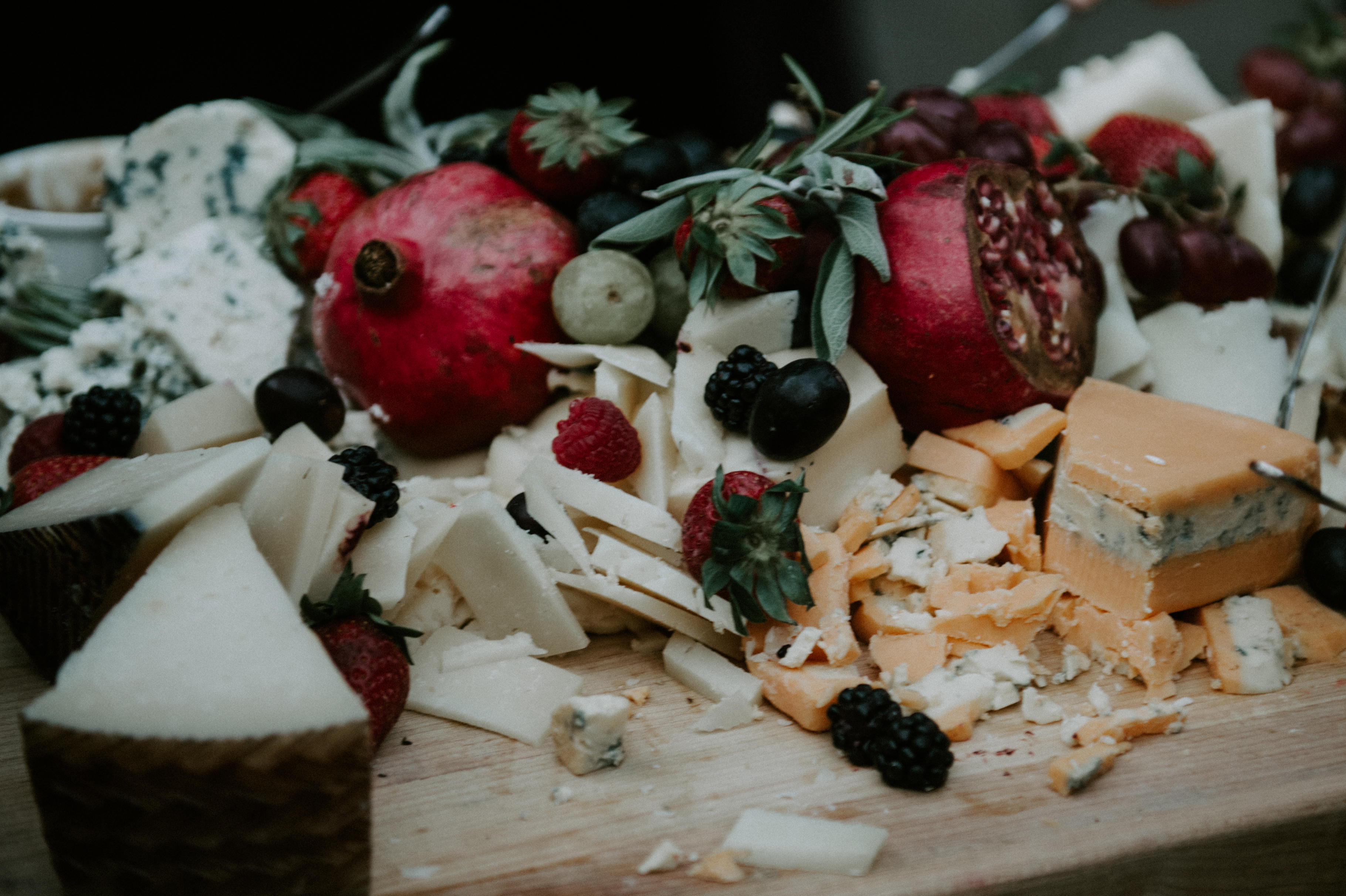 photography: katie slater photography // floral: jakkelyn iris
Fall Wedding Color Palettes: Color Soaked and Whimsical

ivory // gold // vintage pink // magenta // lipstick red // thistle blue // plum


photography: laura dee // floral: just for you floral design // bridesmaids dresses: bella bridesmaids
Fall Wedding Color Palettes: Autumn Harvest

ivory // sunshine // peach // pumpkin // serenity // periwinkle // rattan
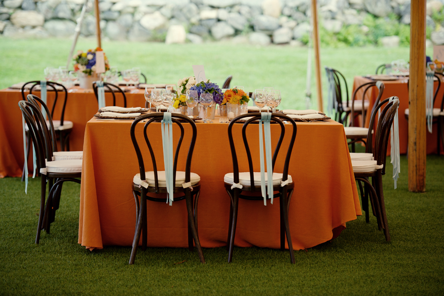
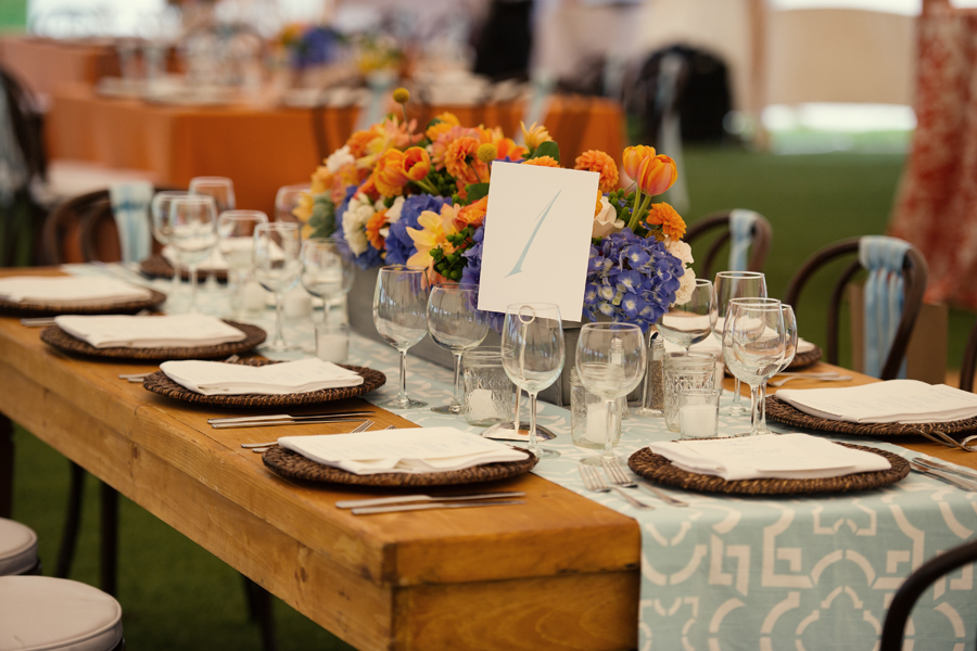
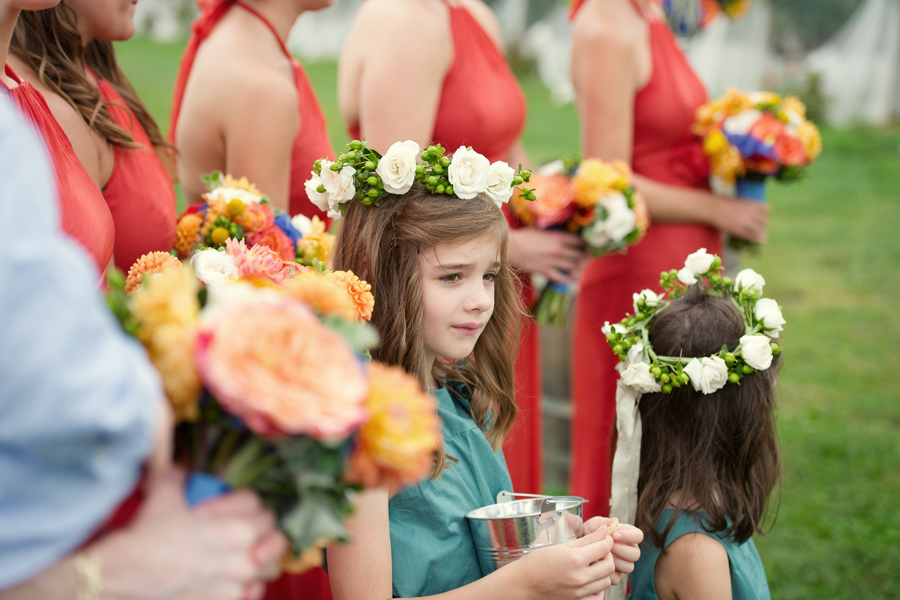
photography: robert & kathleen photography // floral: blush floral design // rentals: party rental ltd. // linens: la tavola linen
When it comes to your color palette and design, don’t hesitate to include the tones that speak to you. You can fit your beloved shades into any season and venue!
**all designs created by Jubilee Events
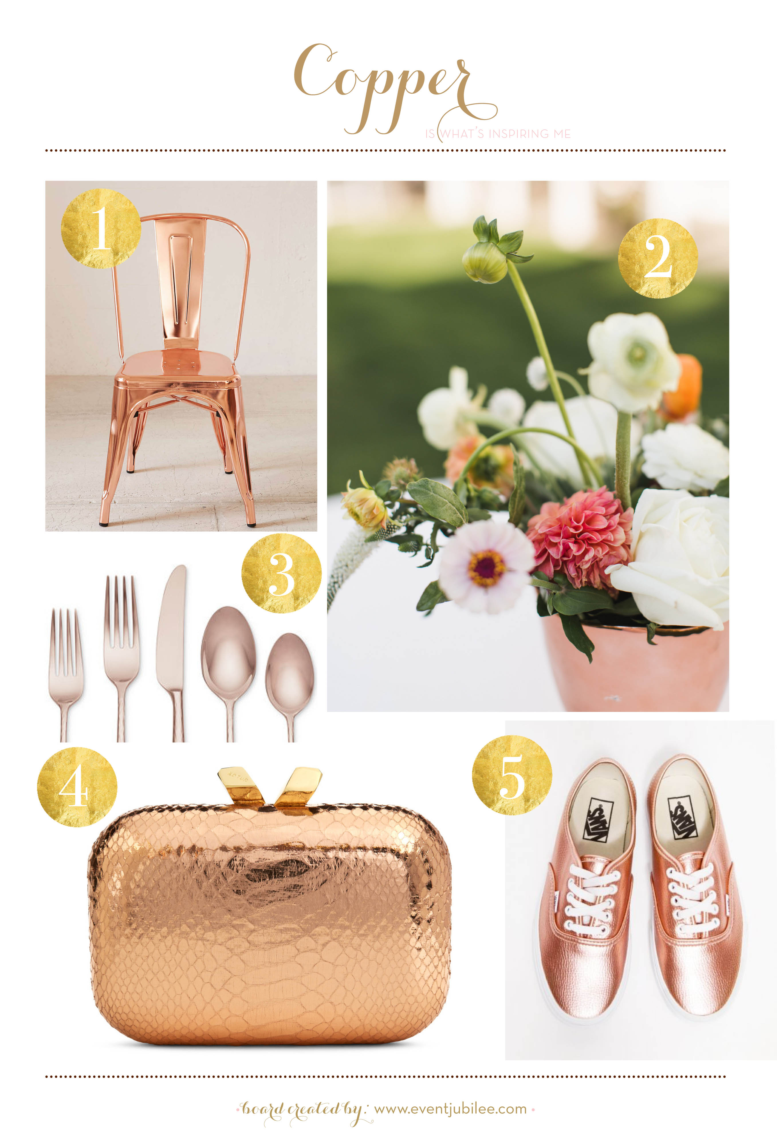
Copper is our newest color crush. We love this warm metallic shade and think it’s perfect for brightening up events during the winter or summer months. Make a bold impact by setting shinny copper chairs around your table, or keep the look subtle by incorporating copper flatware or copper containers for your flower arrangements.
You can carry a copper clutch on your wedding day—our pick comes from Rent the Runway. What’s more, you can take this take this look beyond the big event. Stock your registry with copper goodies or pack comfy metallic sneakers for the honeymoon.
For more copper inspiration, visit us on Pinterest!
1. Wren Metal Chair from Urban Outfitters // 2. Floral design by Jakkelyn Iris Flowers. Photo by Ashley Caroline Photography // 3. Marchesa by Lenox Imperial Caviar Rose Gold 5-Pc. Place Setting // 4. Kotur clutch via Rent the Runway // 5. Glitter Leather Vans
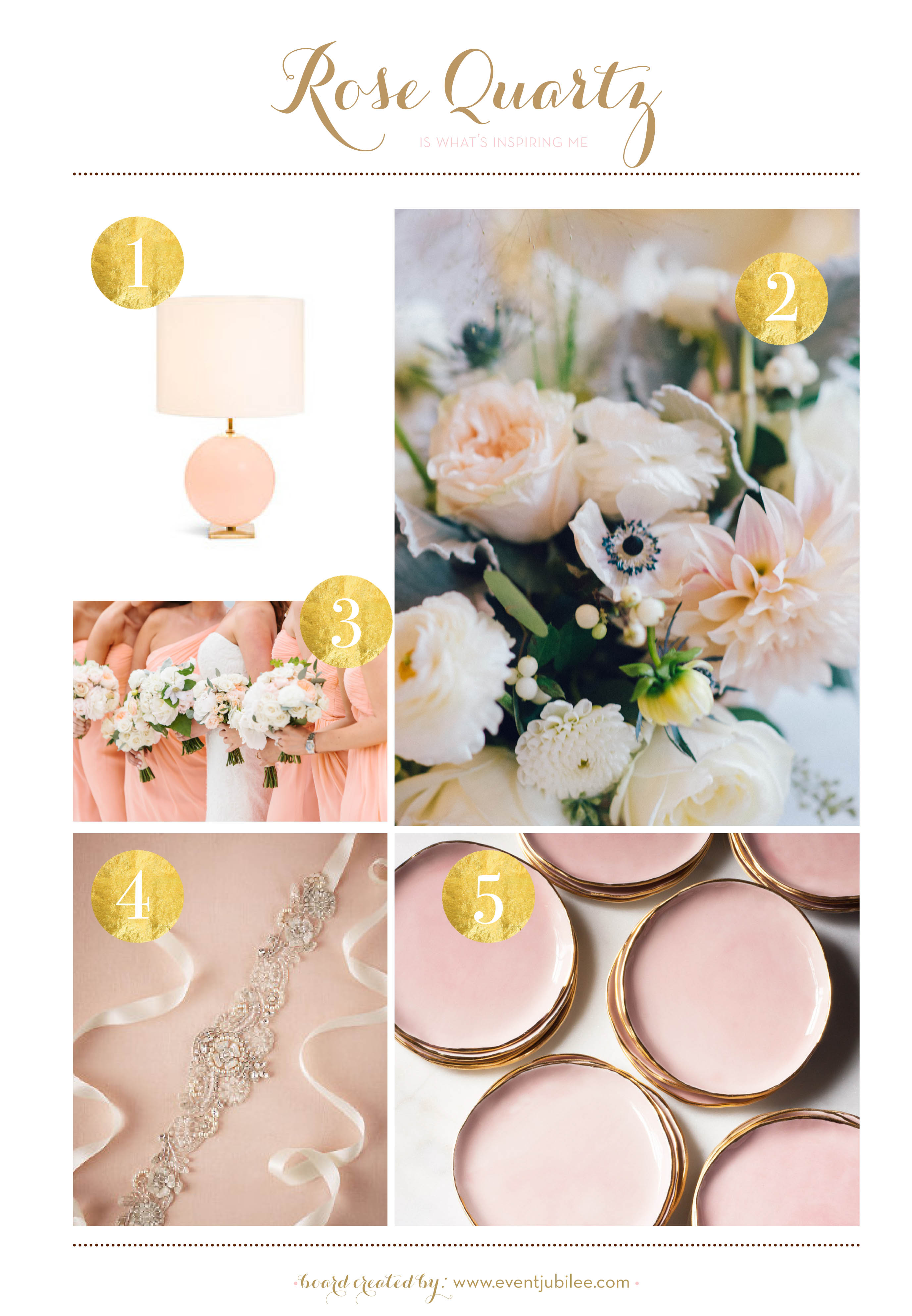
We understand that it’s easy to fall in love with a color. We have real strong feelings for rose quartz, which just happens to be Pantone’s 2016 Color of the Year. We love this soft and feminine hue, and get excited when brides ask us to incorporate it into their wedding design.
This darling shade is perfect for after the wedding, too! If you’re a rose quartz lover like ourselves you’ve come to the right place. We gathered our favorite images from our archives and the prettiest pink products to show you how you can use the color on your wedding day and in your home!
1. Kate Spade Elsie Table Lamp // 2. Floral design by Jakkelyn Iris Flowers. Photo by Maggie Conley Photography // 3. Bouquet by Greenlion Weddings. Photo by Erin McGinn. // 4. Madison Sash from BHLDN // 5. Dessert Plates in Rose and Gold from Suite One Studio
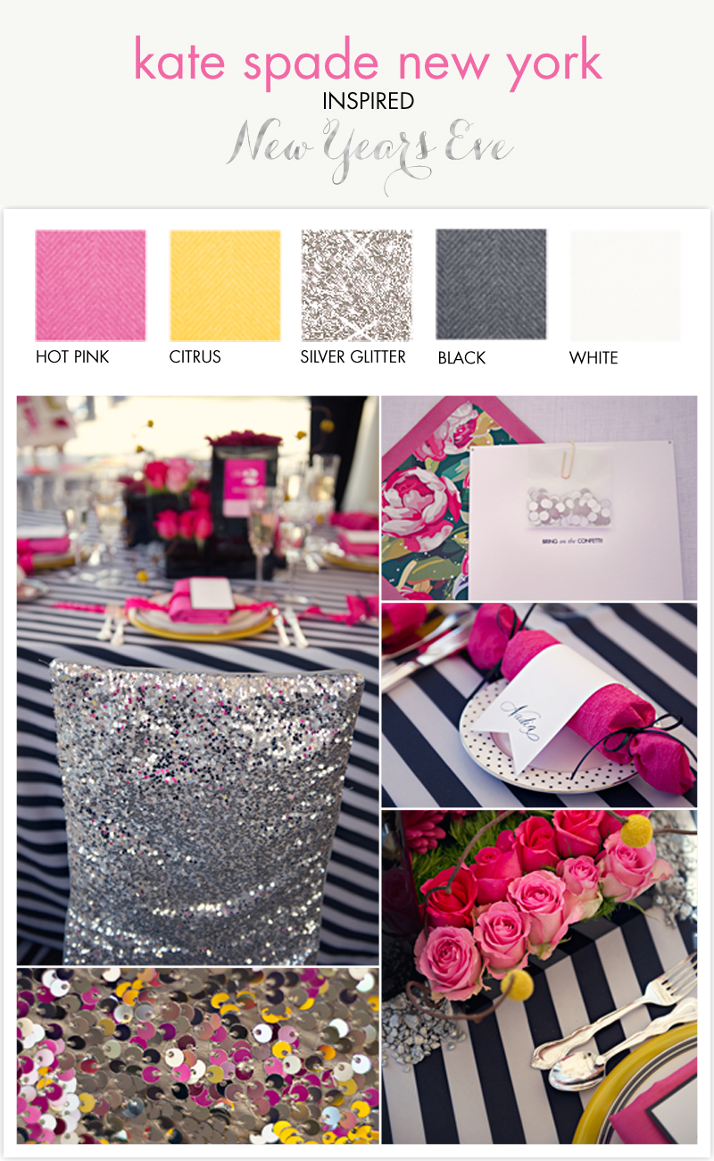
- Black and White Contrasting Stripes: We love this linen we used, but if you don’t have a black and white linen, try making black and white striped menu cards or searching for some black and white striped napkins.
- Bright Yellow Charger: One of our favorite details! This charger plate works because it’s a bright color and ties in the yellow from our centerpiece. Don’t have (or can’t find) yellow chargers? Pick up some inexpensive yellow bread plates and/or dessert plates and layer your dishes. You can also pick up some yellow paper at your local craft store and cut it into large circles, which will act like a placemat under each placesetting.
- Confetti Crackers: These are so easy to make! Save those empty toilet paper rolls and head over to this website for a simple tutorial.
- Sequin (obvi!): There are plenty of ways to get a little sparkle into your tablescape. Don’t have sequin chair covers (if you do– props!)? Use sequin ribbon on your chairs, around your napkin, or wrapped around your centerpieces.
VENDOR REEL
Design: Jubilee Events
Photography: Carla Ten Eyck
Paper: Coral Pheasant
Floral Design: Tony Palmieri
Linens: La Tavola Linen
Rentals: Party Rental Ltd.
{
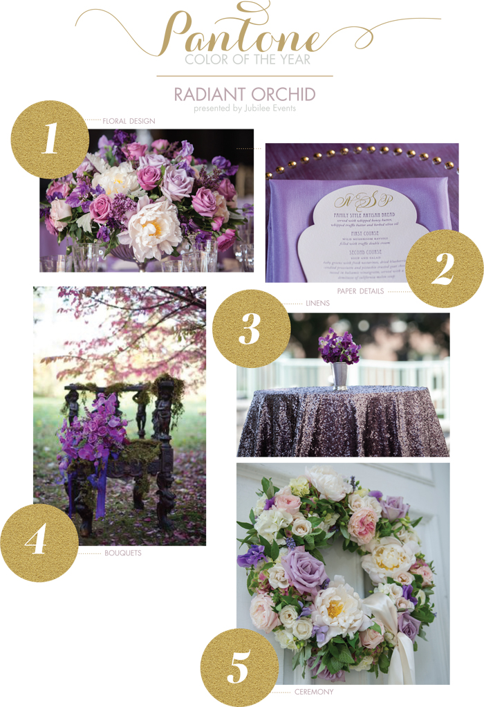
1. purple centerpiece with floral design by hana floral design // 2. purple linens from la tavola linens and gold foil letterpress menu by coral pheasant // 3. purple linens from la tavola linens // 4. floral bouquet by datura: a modern garden // 5. floral church wreath by hana floral design
Color experts Pantone released their color of the year for 2014– and it’s a shade of purple know as Radiant Orchid! We’ve done so many gorgeous events, celebrations and weddings in this tone. I thought I’d share a few images from some of our favorite parties featuring Radiant Orchid, a color you can easily incorporate into your design through flowers, linens, stationery, food, and details. Enjoy! xx
Happy Friday, lovelies! We wanted you to take a moment during your planning and read this message. We know sometimes it can be hard to do with all the decisions being made and all the items on your to do list… but for today, take a moment, and enjoy it. xoxo!